I kicked off the initiative by diving into a rigorous visual and structural audit of the Me@Woolies portal to uncover barriers holding back our team members. By running deep evaluations across our active pages, I hunted down compliance gaps like poor colour contrast, missing descriptive titles, unlabelled interactive components, and form inputs with no error feedback. I captured and categorised these violations in a centralised tracking space, building a clear, data-backed map that aligned our product teams on exactly what was broken and how we needed to fix it.
I wanted to make sure our team members using assistive technologies never hit a digital dead end while trying to do their jobs. I restructured the keyboard journey from scratch, utilising WCAG 2.4.3 Focus Order to guarantee navigating via the tab key felt completely natural, and adding a quick skip option under WCAG 2.4.1 Bypass Blocks. This structural shift gave users a clear pathway to leap over massive header menus and land straight onto core content.
I also worked on the backend page ordering so that VoiceOver reads content in the correct sequence - ensuring screen reader users experience the portal in a logical, predictable flow. Sharp, visible focus outline borders were added to all interactive elements to further assist users in understanding their keyboard position and navigating the site effectively.
Translating our accessibility strategy into tangible interfaces required a precise visual refresh within Figma. From designing a new foundational button palette that strictly met WCAG colour contrast ratios, introducing error states across every form input type (since error messaging didn't exist before), crafting highly intentional focus states including visible rectangle focus borders on all interactive elements, and a 'skip to main content' bypass block that becomes visually prominent exactly when a user needs it.
To ensure these standards scaled, I rebuilt the entire input field component library in the Me@Woolies design system — each component now ships with a complete set of states including default, focus, filled, disabled, and error. I documented every newly accessible component so the team could apply them consistently going forward.

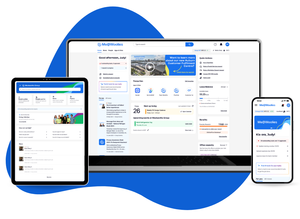
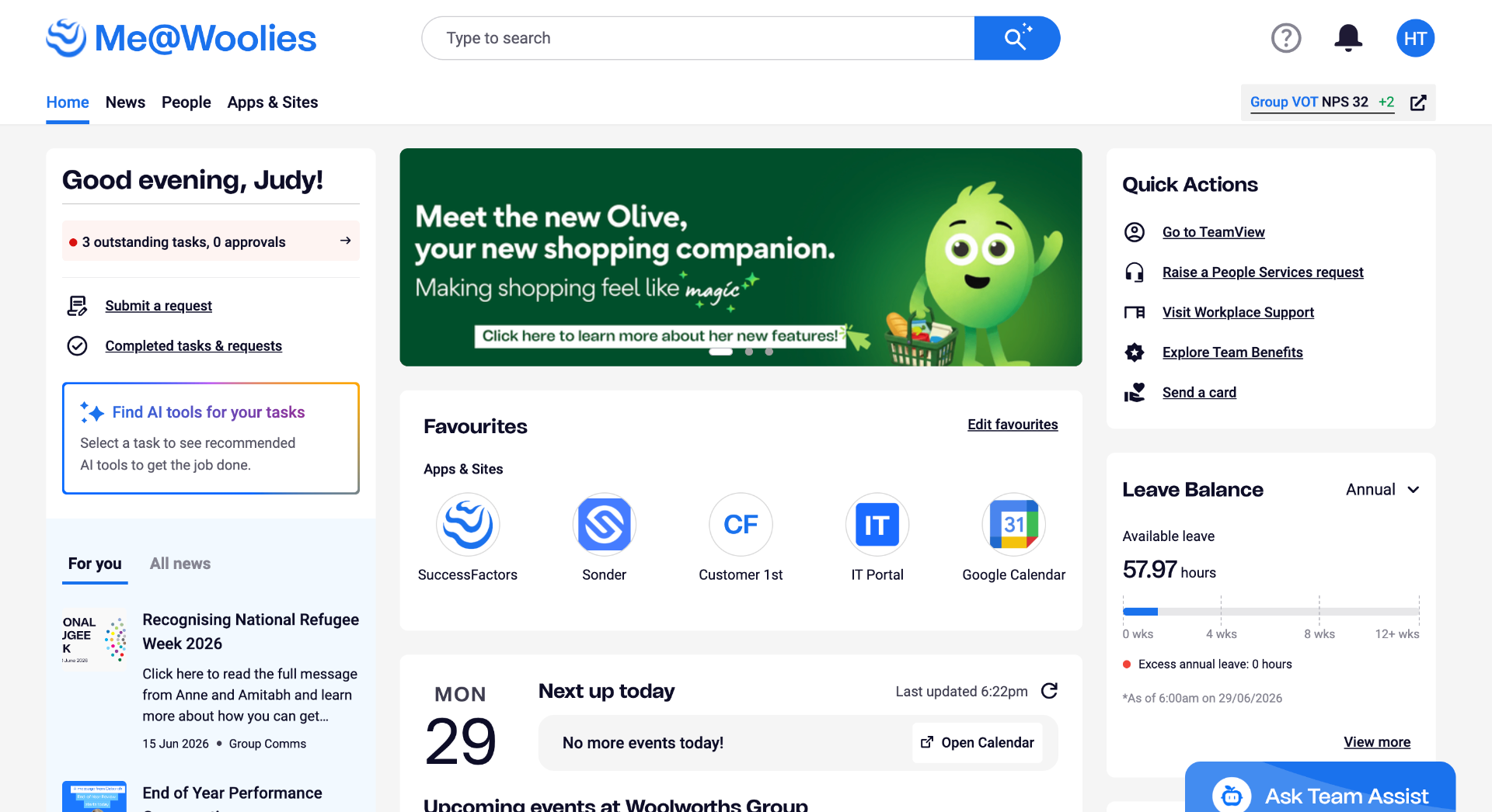
Me@Woolies portal — post accessibility uplift
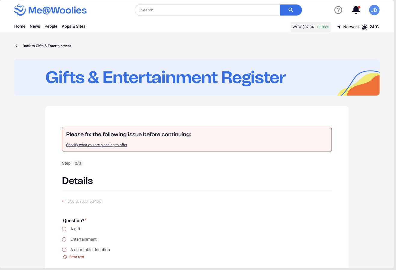
Top-of-form error summary + inline field error states
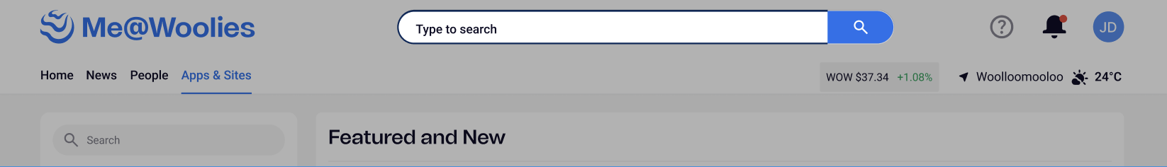
Skip to main content bypass block — keyboard focus triggered
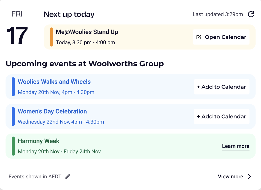
Events component — post uplift
Quality assurance became my closest collaboration during the final push. I wrote detailed test scripts across Windows and macOS, mapping every accessible interaction path our team members might take - including keyboard navigation flows, screen reader traversal order, and error state triggering across all form inputs.
I ran hands-on testing with assistive technologies including VoiceOver and keyboard-only navigation, and ran demos to upskill QA specialists on what correct accessible behaviour should look and feel like during Build Verification Testing. All of this ensured our inclusive designs didn't degrade in translation to production.
Accessibility isn't a one-time patch; it requires a cultural shift in how cross-functional teams build software long-term. To ensure our progress scaled, I launched the Accessibility Uplift Project Hub to serve as our single source of truth. I wrote comprehensive requirements, defined user stories, and mapped documented product agreements between designers and developers — plus custom screen-reader how-to guides for Windows and Mac.
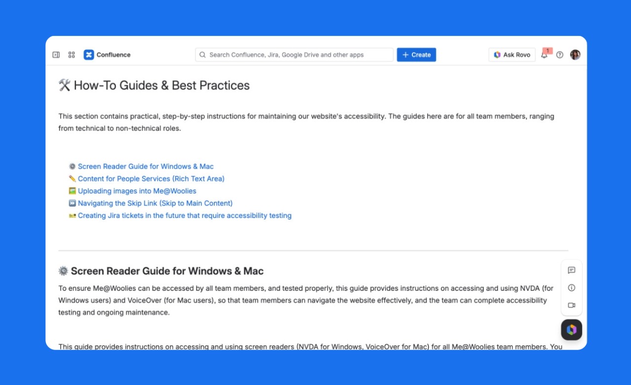
Accessibility Uplift Project Hub — how-to guides and best practices
The completion of this project transformed Me@Woolies into a genuinely inclusive digital experience. Every button, form field, error state, and interactive element now meets WCAG Level A and AA standards, with several Level AAA criteria met in addition. The entire input component library was rebuilt from the ground up, keyboard navigation was restructured end-to-end, and VoiceOver reading order was corrected across all active pages. Our 200,000+ team members across Australia and New Zealand — regardless of ability — can now navigate the portal with confidence and ease. The initiative didn't just improve compliance metrics; it fundamentally shifted how our entire product team thinks about inclusive design and its importance in ensuring equitable digital access.